Components & Symbol Library
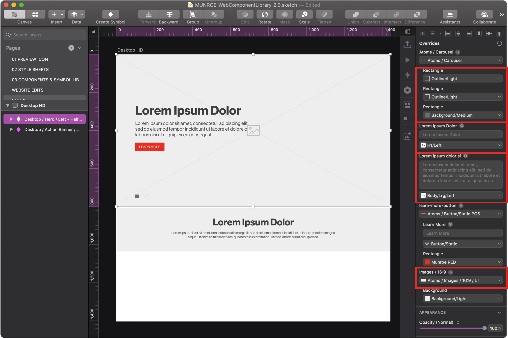
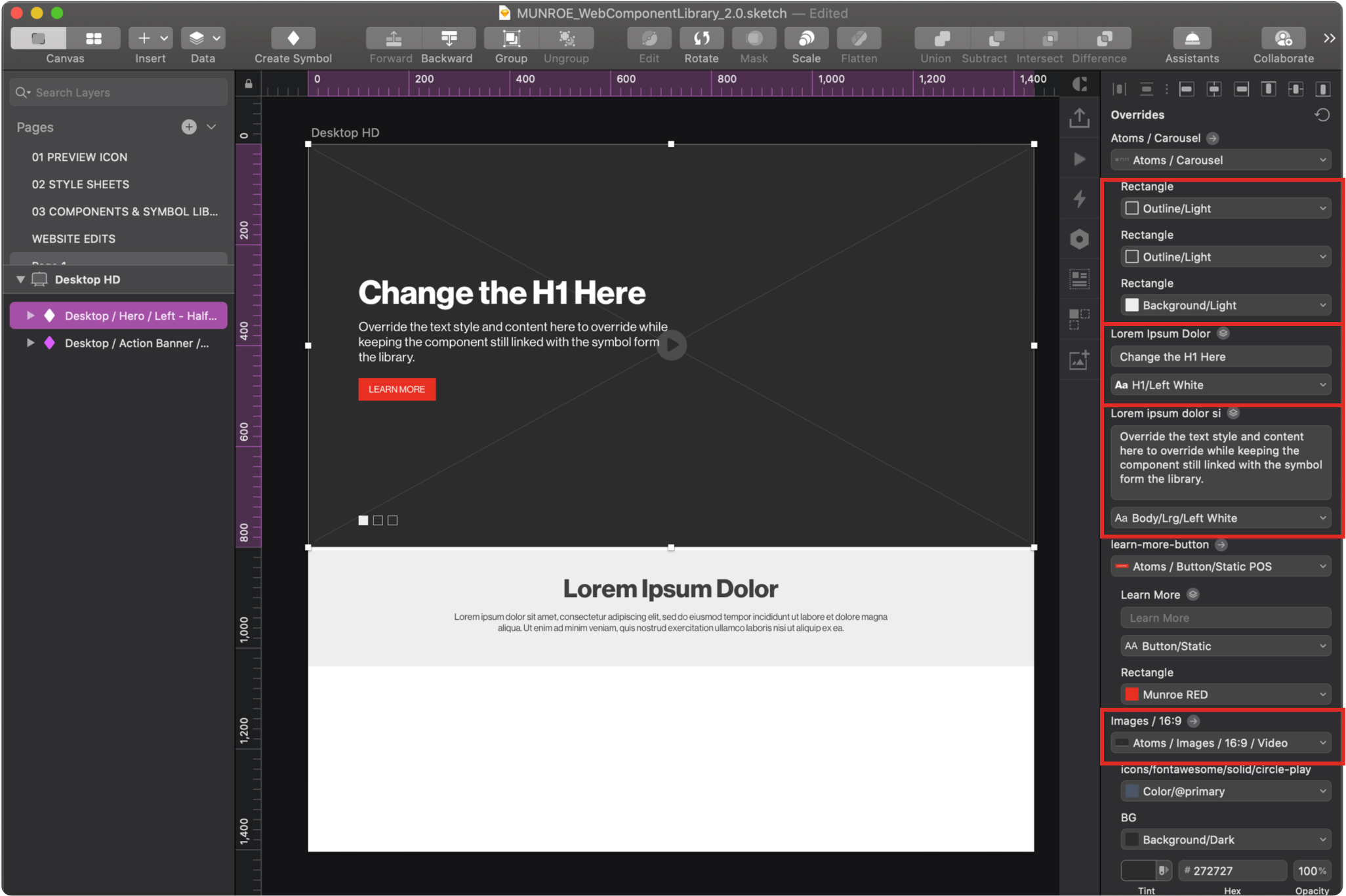
The Components & Symbol Library located within your Web Component Library contains all of the existing low-fidelity Munroe components. After selecting components that fit the needs of your web project from the available components from the Components portion of the library, you can import them as symbols into your low fidelity wireframe website project. If you add a new component to a site, please make sure to design a wireframe version of the component, so that it can be considered for inclusion into the master library and used by everyone.
Once you’ve downloaded the Web Component Library, copied the file and renamed for your particular client, and installed it in your Sketch app, you can add a component to your project by clicking Insert from the top left of your application bar. From the expanded dropdown menu, select the component that you are looking for under Symbols.