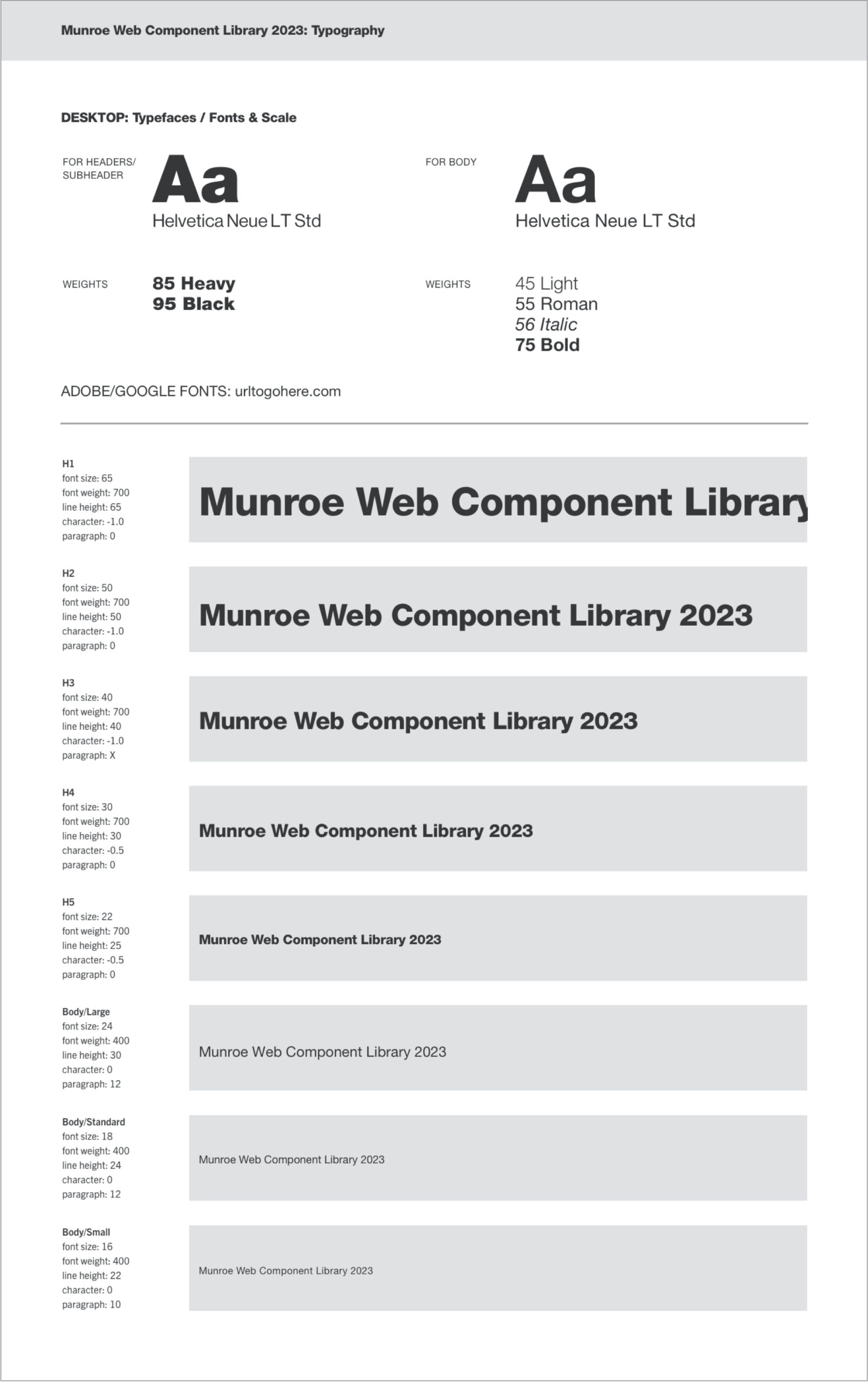
Font Systems
Fonts on the web are render blocking. This means that you will see a white page with nothing on it until all the fonts have been downloaded. Because of this, try to limit the number of font-families you use per website, and try to be stingy with font weights and font styles. Each different font weight and style counts as a unique font to download—italics included.
Helpful Tips:
- Do not use point (pt) to define font sizes. You cannot set size by pt on the web, and it does not convert evenly into pixels (px). Web font sizes can only be set in px, em, or rem. (EM and REM can’t be used in Sketch).
- Use the corresponding number value when indicating font-weight:
- 100 – Thin
- 200 – Extra Light (Ultra Light)
- 300 – Light
- 400 – Normal
- 500 – Medium
- 600 – Semi Bold (Demi Bold)
- 700 – Bold
- 800 – Extra Bold (Ultra Bold)
- 900 – Black (Heavy)
- 950 – Extra Black (Ultra Black)
Font Hierarchy on the Web
Google rewards semantic HTML with higher SEO rankings. Part of semantic HTML is the relative order of text headers (H1, H2, H3…) on a page. Having a semantic layout for headers also helps to make a site accessible for people with disabilities using screen readers and other assistive technologies. By following the rules below, designs will be easily translatable into semantic HTML.
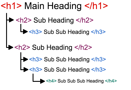
Header Rules:
- Every page must have exactly/only one H1.
- Every page must have an H1 before any other header elements.
- Pages can have multiple H2, H3… elements, but they must appear in a hierarchical order. If you use a H2 as a module header, then paragraph headers inside of that module should be H3’s. If you need to further break one of those paragraphs into different sections, H4’s should be used. Your next module should then start with an H2