Grids
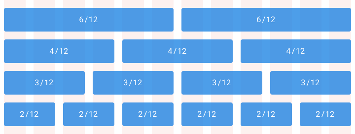
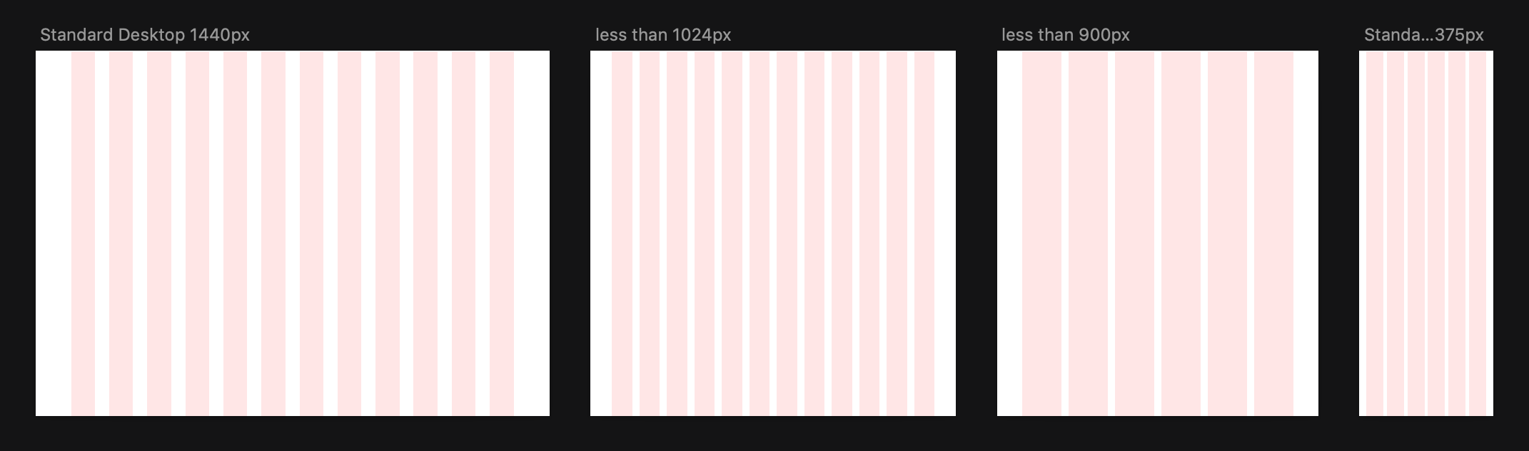
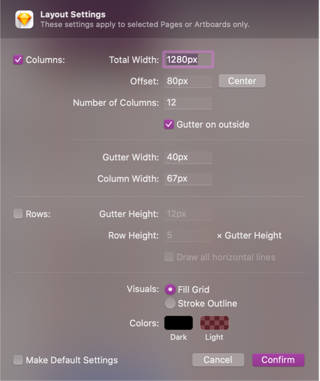
Most sites on the internet, and every Munroe site, run on a 12 column grid. Laying a website out like this helps tremendously when making it responsive between desktop sizes, tablet sizes and mobile sizes. A 12 column grid can be divided by 1, 2, 3, 4, 6 and 12. So it is very flexible.
We can develop modules that do not fit with the grid, like a group of images arranged in a ‘masonry’ layout, however there needs to be a user based or UX based reason for doing so. Module row width should remain consistent from desktop screens to mobile screens. If a row is full-width on desktop screens (content in the row touches the edge of the screen), that row should be full-width on mobile screens, and if a row has gutters on desktop screens (content in that row doesn’t touch the edge of the page), it should also have gutters on mobile screens.