Images

Images are often the largest and most time consuming chunk of a downloading webpage. They are also often the best content on a page.

Below is a breakdown of the munroe.com homepage. It is fairly representational of most sites we do, if anything it loads more scripts than most other sites we build. Note how images account for ~75% of the page’s size. Overall page size and the speed at which a page downloads have a large effect on SEO rankings, so making sure each image is the correct size is very important, and can have a real impact on page speed and SEO rank. Images are usually the single largest, and easiest, page speed optimization opportunity for a website.

Optimization for the Web

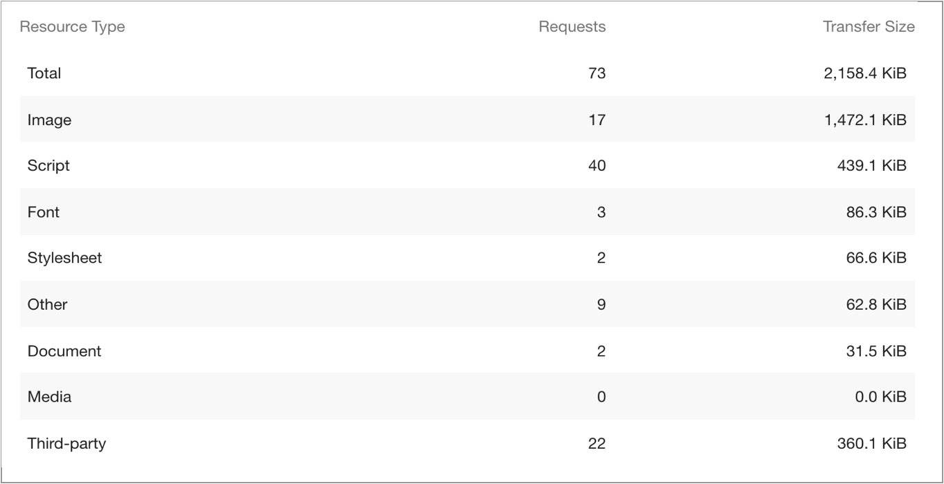
A loose benchmark web developers are aiming for when looking at page size is 1MB – 2MB. Pages that meet this benchmark will generally download in under 2 seconds, which is important because people begin to bounce from a page that has not loaded after 2 seconds, and every second after that the number of people who leave increases exponentially. So to avoid people leaving without seeing the content, it needs to load in under 2 seconds.

Every image that goes onto a website should be optimized. Unfortunately, this can mean drastically different things for different images. The first step to optimizing an image is choosing the right file type. Image optimization is a design consideration, and images should be optimized before they reach the web developer.

Image File Types

  • JPG: are the most common image format, and are the best choice for larger images with lots of colors. They support lossy and lossless optimization, and each JPG should be reduced in size until the optimization becomes noticable in the quality of the image. For some images this means reducing them to 90%, for others it could mean taking them down to 15%.
  • PNG: are traditionally lossless, however there are now programs that will optimize a png, some in a lossy way and others in a lossless way. In general, you only want to use PNGs over a JPG if the background of the image needs to be transparent, or for small images with limited colors (they produce smaller file sizes for small simple images).
  • GIF: are large and lossless. They should be used only when you need an animated image.
  • SVG: are the best choice if the image was created by vectors. They are most commonly used as icons, and they will typically produce the smallest and fastest files. They are a lossless format that can scale infinetly on the web while remaining crisp. They can also be animated on the web via CSS and JS, making them a versatile and excellent choice when appropriate.

If you are using a JPG, the next thing you need to do is find the correct optimization level. Every image is different, so for the best results don’t just save every JPG at 60% compression. Look at what happens to the image at different levels of compression, and decide which one works best.

Optimization Examples

JPG – 590 KB – Image looks great, but its too large. 590KB is ~25% of 2MB, too much for one image to take up.

JPG – 68 KB – Image looks bad.

JPG – 151 KB – Image looks great, and the file size is pretty good.

Photoshop, Skecth, or ImageOptim can be used to optimize files in a lossy and lossless way.

Aspect Ratio for the Web

When running a Google performance test, images that are not cropped to the aspect ratio that they displayed at (images that have their aspect ratio changed by CSS), will now get flagged. To avoid this, always make sure that images are cropped to the aspect ratio they will be displayed at. Images should be the correct aspect ratio before they reach web development. Any images that are part of a larger group, such as icons or portraits meant to appear on a team page, need to have the same height and width in addition to the same aspect ratio.

Scale for the Web

  • If you have an image where you don’t want to force an aspect ratio and the image’s width is less than 100% of its parent column, save images at exactly 200% (2x) to the asset folder.
  • Most images will have a width set to 100% of their parent column, save these types of images at 100% – 200% to the asset folder.
  • For full-screen images that touch the edge of the browser and are not contained within a set-width row (often hero images), using an image ~1920px wide is recommended.

The important thing is to consider the widest possibility for all screen sizes, and size accordingly. Images should be sized correctly before they reach web development.

Image Placeholders in Sketch

Use the Munroe Component Web library to quickly assign low-fidelity placeholder images at common aspect ratios to your web project. You can find the low-fidelity image placeholders here: MUNROE_WebComponentLibrary_2.0 > Atoms > Images.

To add an image to your project click Insert from the top left of your application bar. From the expanded dropdown menu, select the image you are looking for under Symbols. We’ve expanded this portion to include dark mode, video and circle placeholders.